


Project:
Increasing retention via engaging actions
COMPANY:
Dailymotion
ROLE:
Product design, Product management
SCOPE:
Consumer tech, Product design, Mobile app
TEAM:
Data team, Devs, Product manager, QA, User research team
Timeline:
1 year
Context
When I joined Dailymotion, the mobile app was primarily a 16:9 video consumption product focused on news and sports. The audience was mostly men aged 30–50, engagement was low, and the product was not growing. In 2022–2023, the company made a strategic shift on the consumer side toward a social-media–oriented experience. Mobile apps became the experimentation playground, with successful patterns later adapted to the web rather than mirrored from it. This pivot required rethinking the product foundations—not only visually, but in terms of behaviors, habits, and social dynamics.
Problem
PREVIOUS LIKE EXPERIENCE
Challenge
Design process
Rethinking Likes: From Binary to Expressive and Back Again
We initially hypothesized that a non-binary rating system would allow users to express nuance beyond a simple like, resulting in richer engagement and better recommendation signals. We introduced a slider-based interaction with five levels, supported by emojis, and explored different metaphors through prototyping and research. Early tests were encouraging: users understood the interaction, enjoyed the expressiveness, and likes per video start increased by 5%.
However, over time adoption declined. The interaction required more effort than a simple tap, the entry point was unfamiliar, and the mental model conflicted with deeply learned social media behaviors. While users were initially curious, friction eventually outweighed value. Based on these signals, we made the deliberate decision to abandon the non-binary system and return to a standard like icon, prioritizing long-term adoption over novelty.
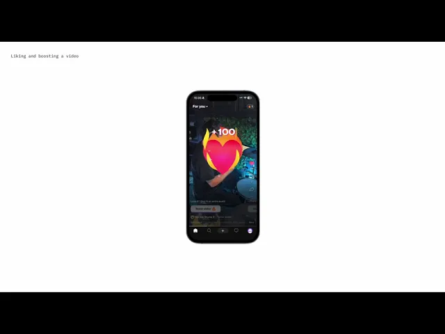
Instead of reinventing the action, we enriched it. We hypothesized that adding expressiveness through gestures—without changing the core mental model—would increase engagement. We introduced multiple intuitive gestures: single tap, double tap, triple tap, and long press. A long press triggered playful, haptic-enhanced heart animations shooting from the user’s thumb and landing on the like icon. Likes became cumulative, allowing users to support a video from 1 to 10. This preserved simplicity while adding depth, delight, and clearer signals of support for creators.
Building Conversations: Text Comments & Video Reacts
Comments initially existed via a third-party web view chosen to avoid building moderation in-house. In practice, this led to slow performance, missing comments, unreliable notifications, and a fragmented experience across app and web. We made the strategic decision to build native comments and handle moderation internally, accepting the added complexity in exchange for control, reliability, and integration. This shift immediately improved trust and usability, and comments per user per month increased by 15%.
To further increase engagement, we surfaced comments directly in the feed through swipeable cards overlaid on the video player. Comments became part of the viewing experience rather than a hidden destination, increasing both visibility and participation.
We also explored video comments, called Reacts. The first implementation failed: Reacts lived in a separate nested feed, opened the front camera without clear context, and left users confused about where and why to consume this content. Usage was extremely low. The key insight was that video reactions are comments, not content. We integrated Reacts directly into the comment experience alongside text comments, as short circular videos similar to video notes. Reacts were also surfaced in the feed cards. This reframing clarified the mental model and increased Reacts per video from 1 to 6.
Solution


Data
15
%
more likes/video
30
more comments & reacts / video/ user
Learnings
What's next
We are now focusing on optimising the comment experience on home. We are iterating on the replies experience and how can we make the experience more community focused.
Enter Password
Hint: Password should be requested or was directly shared